
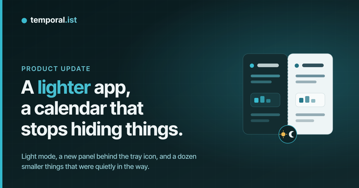
Some days are one big feature. This one was a pile of small things that had
been quietly getting in the way, and they turned out to share a theme: seeing
what you have tracked, without going looking for it.
Here is what changed.
The app has a light mode
The most visible one. There is now a small sun and moon switch on the Settings
row at the bottom of the sidebar. Click it and the whole app fades from the
dark teal you know to a light version of the same thing. Click it again and it
fades back. Your choice is remembered, so the app opens the way you left it.
Dark is still the default, and it stays the default. If you have never touched
the switch, nothing about your app changes. We also deliberately ignore what
your operating system prefers, because plenty of people run a light desktop
and still want a dark app. The switch is the only thing that decides.
One deliberate limit: light mode applies to the app you sign in to, not to the
public website. The marketing pages and the sign-in screen are a designed dark
surface, and turning them light would make them look broken rather than light.
The calendar stops hiding your work
Two things were wrong in the day view, and they were both about the same
frustration: you knew you had worked on something, and the calendar would not
show it to you.
The first was columns. When several projects overlapped on one day, the
calendar packed them into as few columns as it could. That is sensible until
two unrelated projects happen not to overlap in time, at which point they get
put in the same column, and a short session ends up sitting underneath a longer
one. You could see a sliver of it and nothing more. Now, once a day has more
than two projects on it, every project gets its own column. Nothing hides
behind anything.
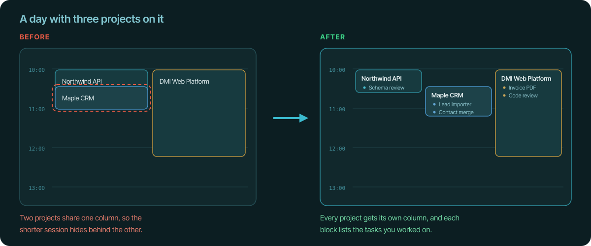
The second was what the blocks said. A calendar block used to be titled with
your task and your project run together, something like "Invoice PDF layout -
DMI Web Platform". It reads fine for one session and badly for a day of them.
Now the block leads with the project name, and the tasks you worked on are
listed underneath as bullets. If you have the day-span setting turned on, so a
project shows as one block per day, that block lists everything you did on it.
The desktop app has a front door
Left-clicking the desktop app's tray icon used to open the website. That was
never quite right. If you are looking at the tray icon, you have a question
about the app itself, and opening a browser tab is a slow way to answer it.
It now opens a small panel instead, and the panel is built around the four
questions people actually ask.
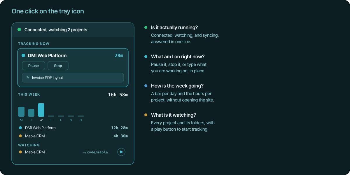
Is it actually running? The top line says so in plain words, including how
many projects are being watched, and it turns red if the file watcher has
stopped. The bottom line tells you whether everything has been synced or
whether some sessions are still queued.
What am I on right now? If something is being tracked, it is right at the
top with the time counting up, and buttons to pause or stop it.
How is the week going? A small bar for each day of the week, your total,
how it compares with last week, and the hours split by project. When you are
signed in this comes from your account, so it includes time tracked in the
browser extension or on another machine. When you are offline it falls back to
what this computer knows, and says so.
What is being watched? Every project, the folders it watches, and how many
paths it ignores.
If you are not signed in, the panel says so and offers a Connect button, and it
still shows the week from what this computer has recorded.
You can pause without stopping
The desktop app has always paused your session when the computer goes to sleep,
so a night of sleep is not billed as work. Until now you could not do that
yourself. If you were going to lunch you had to stop the session and start a
new one afterwards, which turns one afternoon into two entries.
There is now a Pause button on the panel, and a Resume button while you are
paused. The paused stretch is subtracted from your time, exactly the way a
sleep pause is, and the session stays open so you carry on with the same entry
when you come back. While it is paused, file changes are ignored and the idle
timeout will not quietly end it.
There is also a play button next to every project in the watched list, so you
can start tracking something without waiting for the app to notice a file
change. That is useful for the work that does not touch files, like a call or a
whiteboard.
Say what you are working on
Every project has a current task, which is the label that ends up on your
sessions and on your invoices. It has always been settable on the website, and
now the desktop app can set it too.
When a new session starts and the task has not been changed since, the app
shows a notification asking what you are working on. Click it and a small box
opens with the project name and a field. Type a few words and it is applied to
the session that is running as well as the ones that follow.
You can also just click the task in the tray panel and type over it. It turns
into a text field where it sits, so it is one click and a sentence rather than
a trip to the website. If you would rather not be asked, ignore the
notification. It will not nag: there is a cooldown, so the same project cannot
prompt you repeatedly while you work.
You can leave things out
Projects in the desktop app have always had a list of folders to watch. They
now have a second list of files and folders to ignore.
This matters more than it sounds. Pointing the app at a project folder used to
mean pointing it at everything inside, including the parts that change on their
own. A build directory rewriting itself is not you working. Now you can pick
those out with the same file browser you used to add them, and anything inside
an ignored folder is left alone.
The ignore list syncs with your account, so it shows up on the project page on
the website alongside the watched paths, and it follows you to another machine.
And a few smaller things
Changing a project's colour on the projects page now actually changes it on the
page. It was being saved correctly, but the card kept showing the old colour
until you reloaded. If you only changed the colour and nothing else, it was
saved and then silently ignored by the screen in front of you.
The project detail page has an Edit project button, so you no longer have to go
back to the list to rename something or change its rate.
The desktop app's project editor was rebuilt. The watched and ignored lists now
sit side by side, the colour is a row of swatches instead of a trip through
your operating system's colour picker, and the pattern settings moved to their
own tab. Previously, opening those settings made the window taller than the
screen, and the bottom of it was simply unreachable.
None of these are big. All of them were annoying. That is usually the better
kind of day.