
The dashboard has only ever been about you
Open Temporal.ist today and the dashboard answers a set of questions about
one person: how much did I track, on which projects, and what does my
week look like. That's the right answer if you're a team of one.
If you run a team, though, Monday morning sounds different. Is anyone on the
Vance project this week? Did Dwight have a rough week or just a quiet one?
Which of our projects has quietly had nobody on it since June? And how much
of what we did last month have we actually invoiced?
Those are answerable — the time was already being tracked — but you'd have
been picking through filters to reconstruct them one at a time. So we built
a page that just shows them: the Org Dashboard.
Who's working on what
The top of the page is a card for every person in your organisation.
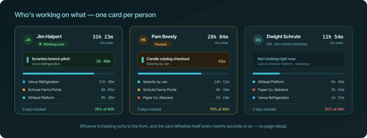
Each card carries the same few things: who they are, whether they're tracking
right now, what they're on at this second, and how the week is adding up per
project. Whoever is actually working sorts to the front, so the top of the
page is always the live part of your team.
The task shown is the one already attached to the session — the description
the desktop app, the browser extension, or the person themselves put on it.
Nobody has to fill in anything new for this page to be useful, which was the
point: if the team has to do extra work to keep a management view honest, the
view stops being honest by about Wednesday.
The cards refresh on their own roughly every twenty seconds. Leave the page
open on a second monitor and it stays current without a reload, and a
session that someone pauses turns amber on the next refresh.
Everyone's week, side by side
Below the cards, the same week in two shapes.
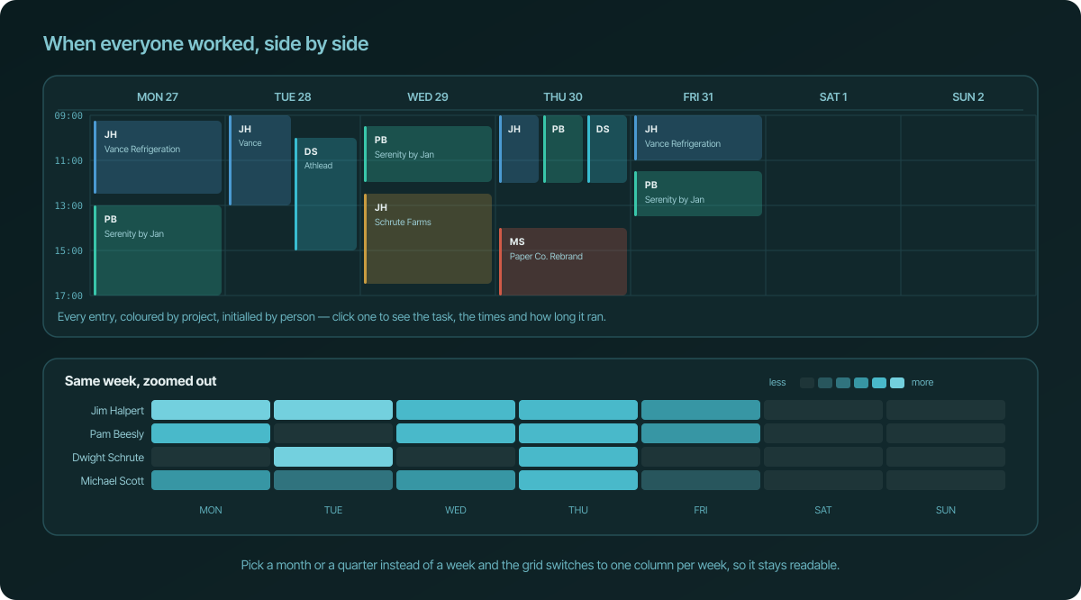
The calendar is the literal answer to "when did people work". Every entry from
every member, in one grid, coloured by project and initialled by person. Where
two people worked at the same time their blocks sit side by side rather than
on top of each other, so a busy Thursday looks busy. Click any block to see the
task, the start and end times, and how long it ran.
The heatmap is the same week with the detail boiled off. One row per person,
one column per day, lighter means more. It's the fastest way to spot the things
totals hide: the person who did their whole week in two days, the weekend that
wasn't a weekend, the colleague who has been quiet since Tuesday. Ask for a
month or a quarter instead and it switches to one column per week so it stays
readable.
Hours per person, in one table
Then the numbers, plainly.
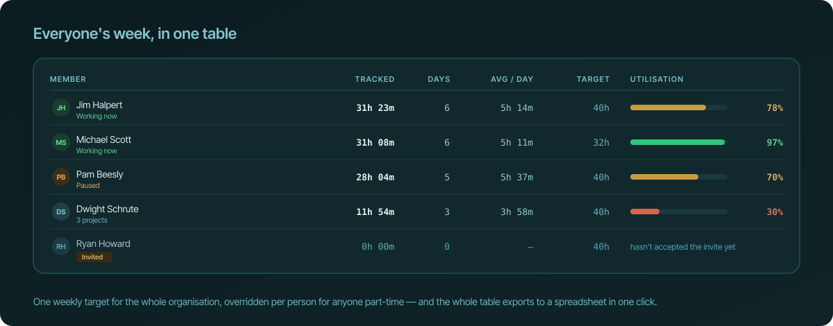
Sort it by hours, days, average day or utilisation, and export the whole thing
to a spreadsheet when someone needs it in an email.
The one genuinely new idea here is the weekly target. Set one number for
the organisation — 40 hours, say — and override it for anyone who works part
time or four days a week. Every figure on the page then knows what "a full
week" means for that person, so 28 hours reads as 70% of Pam's week rather
than as a number you have to hold context for. Pick a month instead of a week
and the target scales with it.
Targets are a measuring stick, not a rule. Nothing is enforced, nobody gets a
warning, and if you'd rather not set them the column just reads "no target".
One small thing we made a point of: people you've invited who haven't accepted
yet show up as Invited rather than as colleagues who mysteriously tracked
zero hours.
The two questions a list of hours never answers
The bottom of the page is for the two things that never show up in a table of
people.
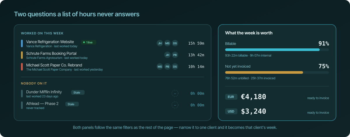
The first is coverage. Projects with people on them, projects with nobody
on them, and how long it's been since anyone touched each one. A project that
has gone quiet for a couple of weeks gets flagged, which is usually either a
finished project you forgot to archive or a client who is about to ring you.
The second is what the week is worth. How much of the time was billable at
all, how much of it is still sitting there un-invoiced, and what that comes to
in money — per currency, because plenty of teams bill some clients in euros and
others in dollars. It uses the rates you've already set on the project, the
client, or the organisation, so it's the same arithmetic your invoices use.
Everything follows the filter
There's one filter bar at the top and everything on the page obeys it: a date
range with week / month / quarter / year shortcuts, plus members, teams,
projects and clients, and a switch for unbilled time only.
Filter to one client and the whole page becomes that client's week — their
projects, who worked on them, when, and what's ready to bill. Filter to one
person and it becomes a fair, complete answer to "how has Pam's month been",
with no spreadsheet in the middle.
It is not a surveillance tool, and we'd like to keep it that way
A page called "see what everyone is working on" deserves a straight answer
about what it does and doesn't do.
It shows tracked time: sessions, projects, the task text already attached to
those sessions, and totals. That's it. There are no screenshots, no keystroke
counts, no activity percentages, no "focus scores", and no way to see what
anyone had on screen. We don't collect any of that,
so there's nothing for this page to reveal. Every number an admin sees is a
number that person can already see about themselves.
Access is deliberately narrow. Only the organisation's owner and the admins
they've appointed can open the page, and only on a Teams plan. Plain members
don't see the menu item at all, and typing the address in directly just
returns them to their own dashboard.
Where to find it
If you own an organisation or you're one of its admins, Org Dashboard is
now in the sidebar, right under your own Dashboard. If you work solo it won't
appear, because there'd be nothing in it that your own dashboard doesn't
already tell you.
It's part of the Teams plan. If your organisation is on Teams, every
admin has it — they don't need a subscription of their own, they inherit the
organisation's.
And as ever: if it's close to what you needed but not quite, tell us. Plenty of
what we ship started as a ticket someone took a minute to write.